


Let’s Talk Business!
+1 817 380 5522
Let’s Connect

- All
- Languages
- Gen AI platforms
- Frameworks
- Debugging & Tracing
- Vector Databases
- DBMS
- Data Visualization
Languages

C#

Rust

Python

JavaScript

Java

R
Gen AI platforms

LangChain

Hugging Face

Apache Spark

Gemini

Phi
Frameworks
LangChain

LlamaIndex

PyTorch

Kedro

TensorFlow

Keras
Debugging & Tracing

Langsmith

Langfuse
Vector Databases

PostgreSQL

Chroma

Milvus

Qdrant

Pinecone
DBMS
PostgreSQL

MySQL

MongoDB

CouchDB

Cassandra

Neo4j
Data Visualization

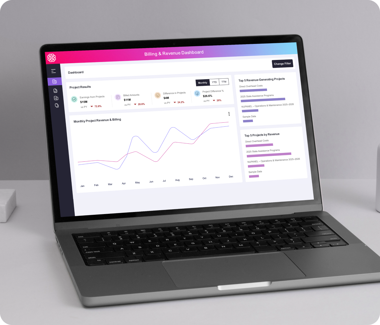
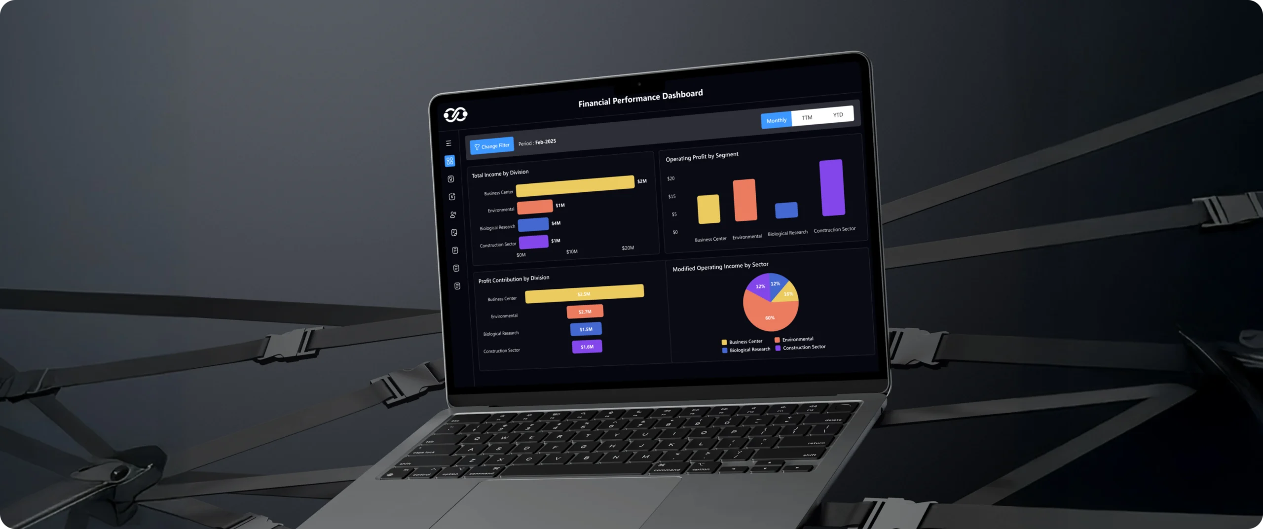
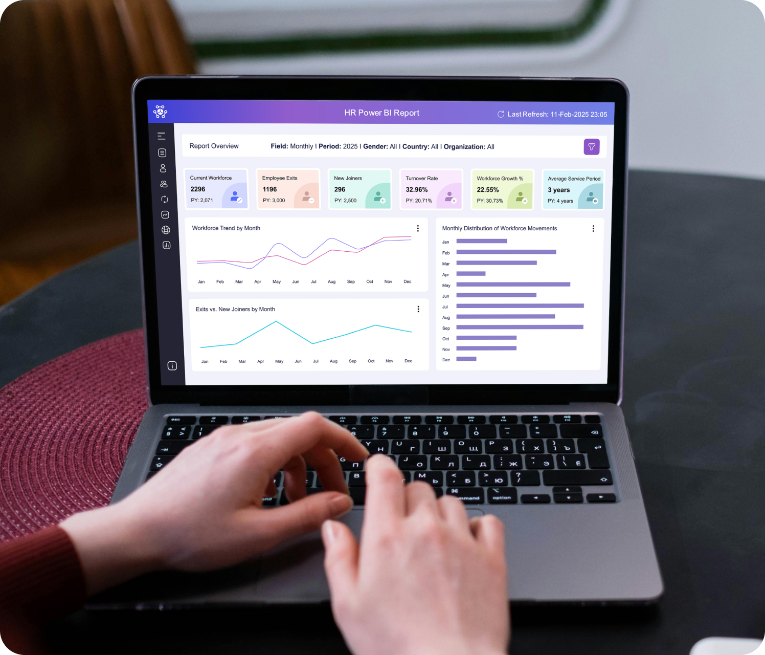
Power BI

Tableau
Languages
C#
Rust
Python
JavaScript
Java
R
Gen AI platforms
LangChain
Hugging Face
Apache Spark
Gemini
Phi
Frameworks
LangChain
LlamaIndex
PyTorch
Kedro
TensorFlow
Keras
Debugging & Tracing
Langsmith
Langfuse
Vector Databases
PostgreSQL
Chroma
Milvus
Qdrant
Pinecone
DBMS
PostgreSQL
MySQL
MongoDB
CouchDB
Cassandra
Neo4j
Data Visualization
Power BI
Tableau


Product & Engineering
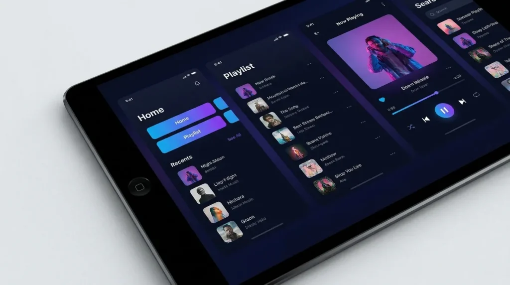
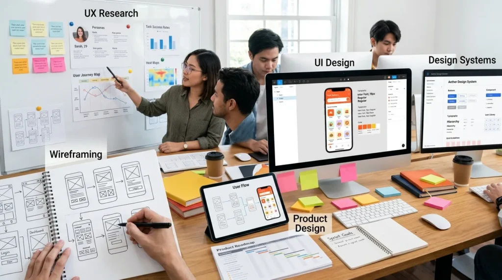
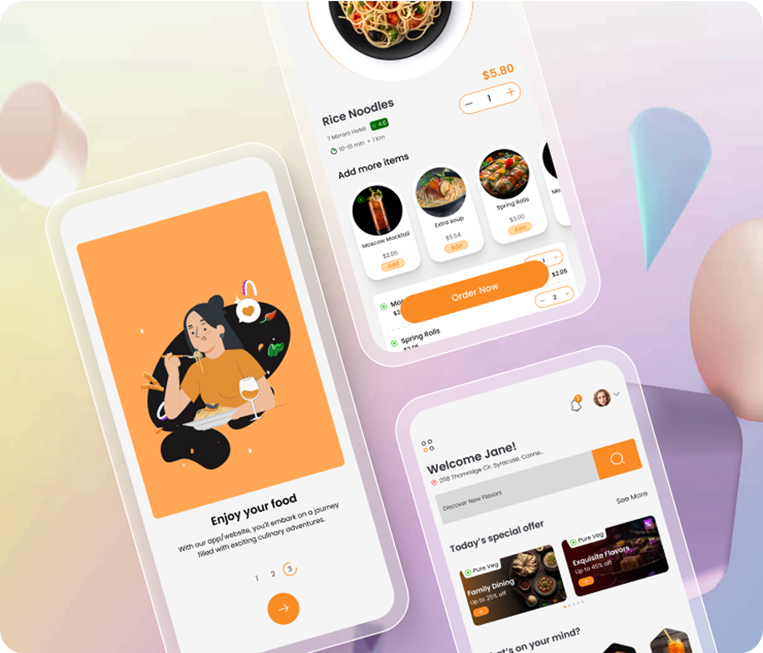
Design systems accelerate delivery through reusable components, reducing rework, inconsistency, and implementation effort across teams.

Design Teams
Governed design systems boost consistency, speed delivery, and enable designers to focus on product problems, not UI recreation.

Brand & Marketing
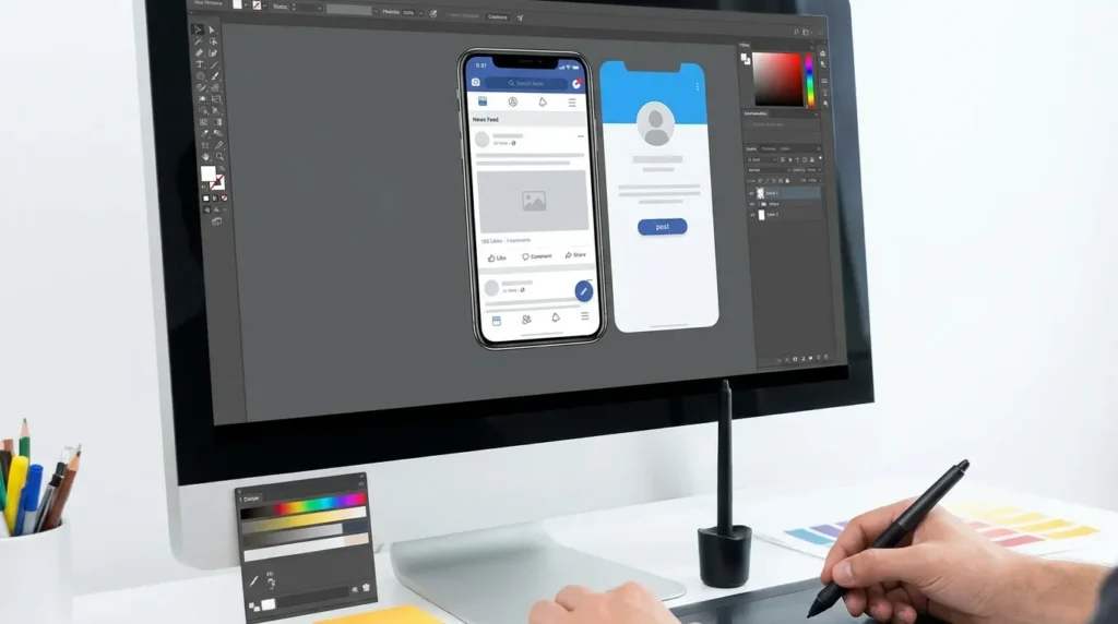
Design tokens centralise branding, enabling consistent updates across products without manual redesign or coordination overhead.

Technology & Architecture
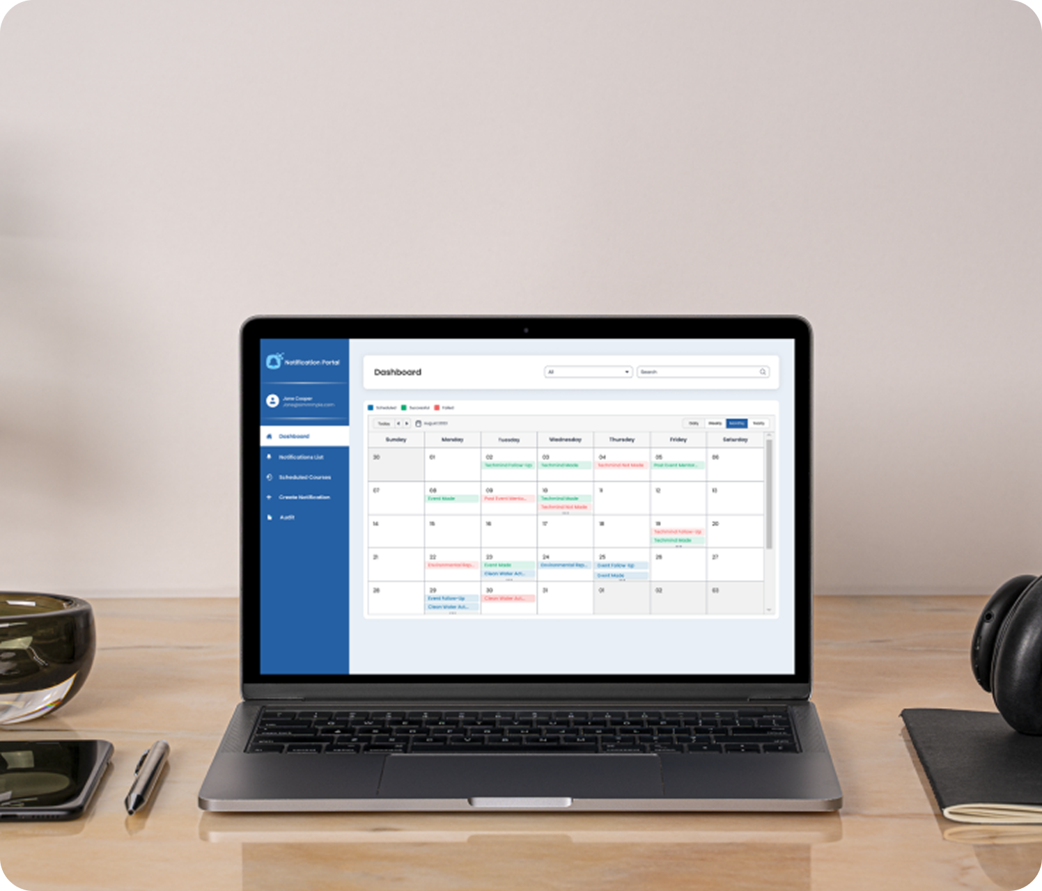
Shared component libraries and design tokens reduce duplication, simplify maintenance, and enable scalable, consistent product development.

Legal & Compliance
System-level accessibility ensures WCAG compliance through reusable components and automated testing, reducing risk and remediation effort.
Finance & Procurement
Design systems reduce feature delivery costs, eliminate duplicate tooling, and generate measurable ROI through reusable, compliant components.
Customer Experience
Consistent UI patterns across products reduce cognitive load, improve usability, and create a seamless customer experience.
Executive Leadership
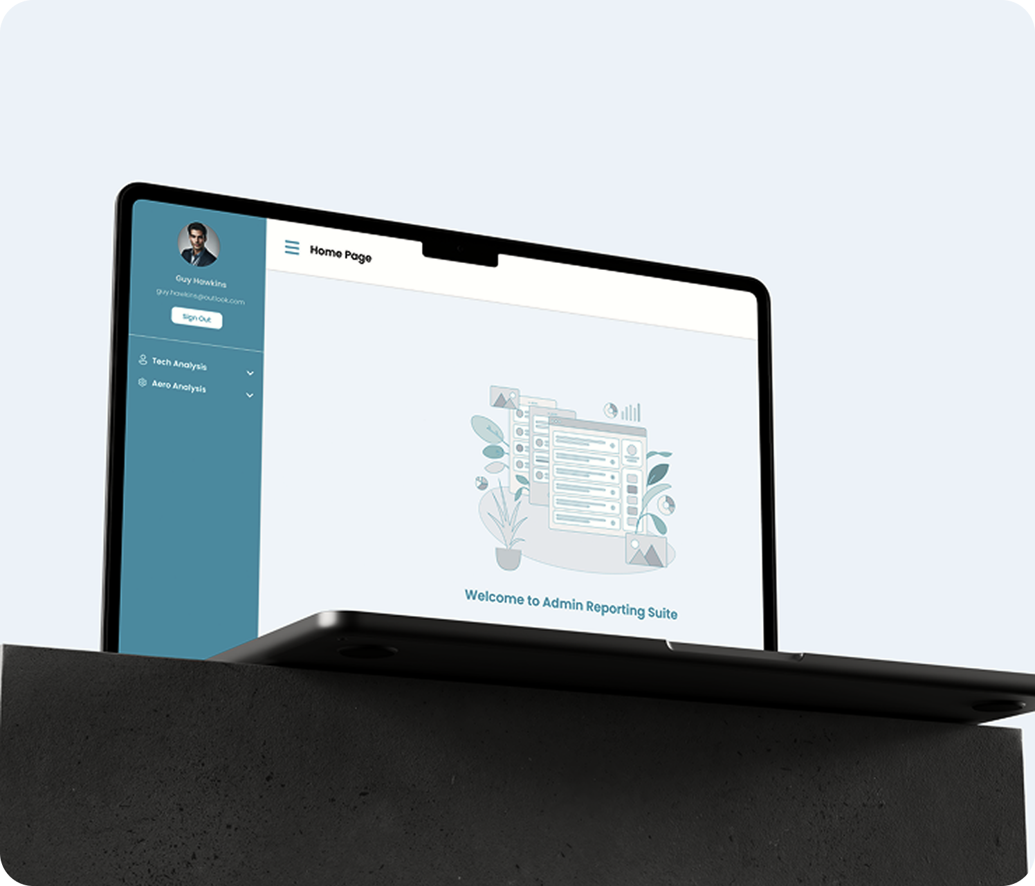
Design systems improve engineering velocity, product quality, and brand governance, delivering scalable value across teams and products.
")
Enterprise Design System - Full Build
End-to-end design system delivery including tokens, component libraries, Figma assets, engineering implementation, Storybook documentation, accessibility standards, CI integration, governance, and adoption tracking - creating a scalable, governed source of truth across teams and products.
Design Token Pipeline
Design token architecture and automation pipelines connecting Figma to web, mobile, and cross-platform applications through versioned token releases, CI validation, and automated distribution - enabling consistent brand governance, theming, and scalable design updates across every product surface.
Component Library Migration
Design system migration services for legacy component libraries, including Material UI, Bootstrap, Ant Design, and bespoke implementations. Delivered through phased, component-level adoption, governed deprecation, migration guidance, versioning, and usage tracking - enabling modernisation without disrupting ongoing product development.
Multi-Brand Design System
Multi-brand design system architecture supporting white-label products and customer-configurable themes through token-based theming and shared components. New brands are deployed through token configuration rather than component rebuilds, enabling scalable governance, consistency, and efficient portfolio-wide maintenance.
Accessibility-First Design System
Accessibility-first design systems built to WCAG 2.1/2.2 standards, with keyboard navigation, ARIA support, colour contrast, screen reader compatibility, and automated axe-core CI testing. Storybook documentation and governance ensure accessibility compliance is embedded across all products from the outset.
Design System Audit & Consolidation Programme
Design system audits covering component inventories, duplication analysis, consistency scoring, accessibility debt, and shadow component detection. Delivered with a phased consolidation and migration roadmap enabling incremental adoption of governed components without disrupting ongoing product delivery.
DesignOps & Governance Programme
DesignOps frameworks covering contribution workflows, RFC processes, review governance, versioning, deprecation management, release controls, and adoption analytics—enabling scalable design system growth, reducing rework, maintaining quality, and ensuring long-term adoption across product teams.
White-Label Product Design System
Design system architecture for white-label SaaS platforms with token-based theming, customer branding controls, theme APIs, and onboarding workflows. Deliver customised brand experiences while maintaining shared components, governance, consistency, and low long-term maintenance overhead.


